Burwell, Nebraska
Community Rebrand
The Challenge & Objectives:
Develop a new brand for the city that highlighted all of Burwell’s unique offerings to show how seemingly disparate lifestyles all call the same place home. Burwell is, after all, home to Nebraska’s Big Rodeo and the Calamus Reservoir.
The new brand included: logo design, messaging guide, visual style guide, and photography.
Our biggest challenge here was finding a way to unite four lifestyles — farming, ranching, small town, and lake life — into one cohesive style that would help with tourism and economic development.
Strategy & Tactics:
Like all of our community rebrand projects, we began with research. We took multiple trips out to Burwell to explore the city and surrounding areas and to interview members of the community. We spoke with high school students, local business owners, city administration, recent college grads, people who have lived their entire lives in Burwell, people who live and work at the Calamus Reservoir, one pastor, the police chief, and school principals.
Needless to say, all that research gave us a pretty clear idea about what Burwell is and where we needed to go next.
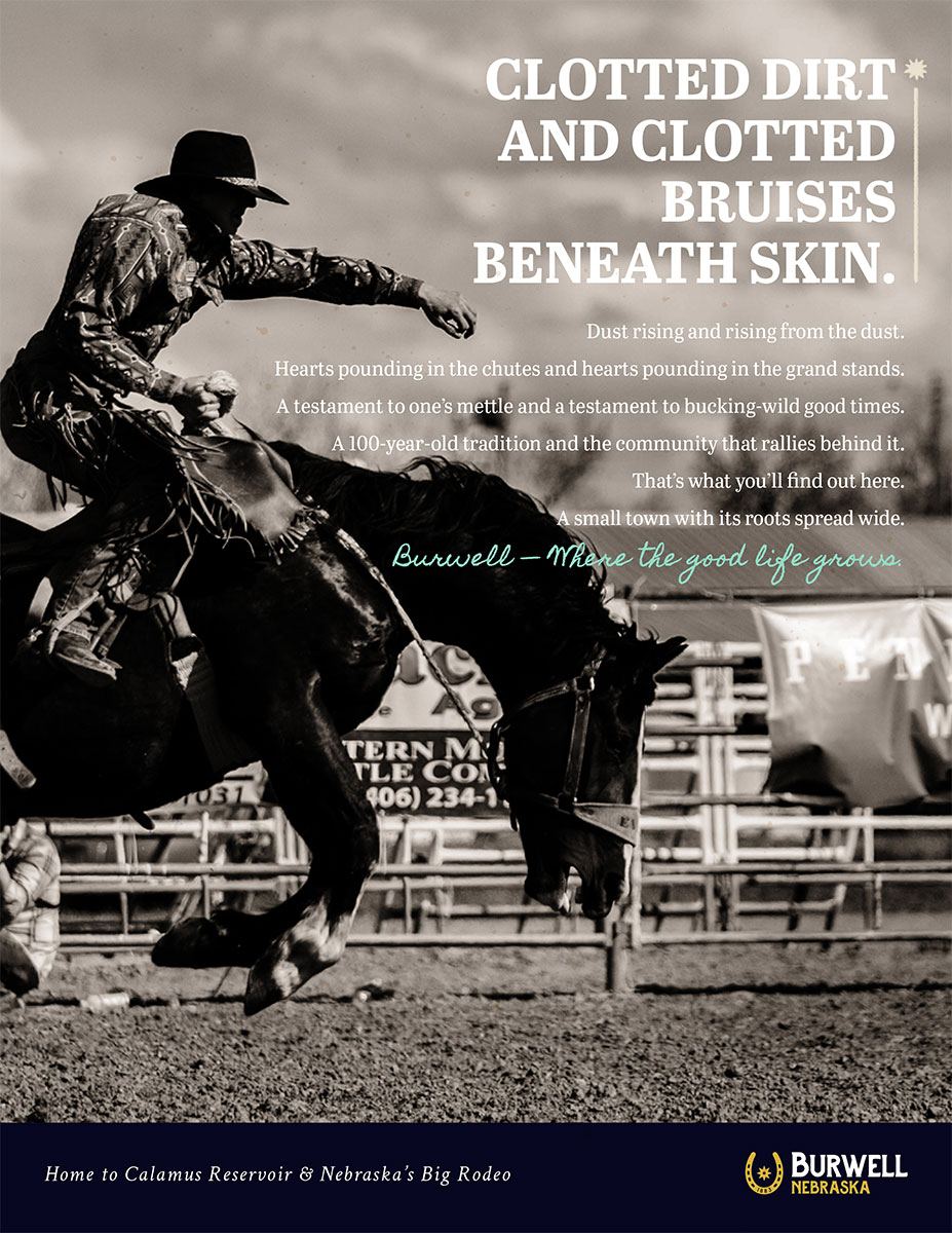
After multiple brainstorming sessions, lots of trial and error, we finally found a tagline that unifies the entire community and its four distinct lifestyles: Where the good life grows.
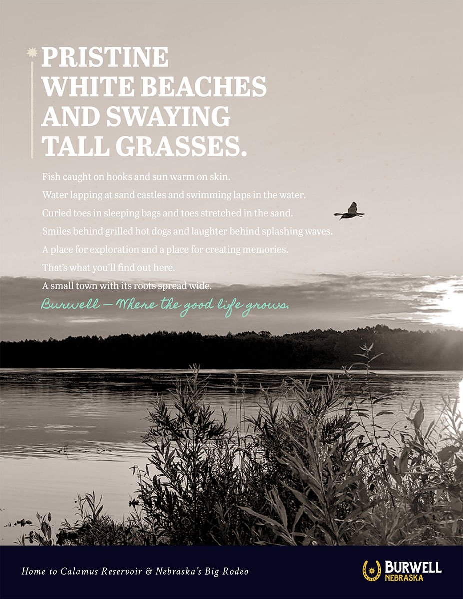
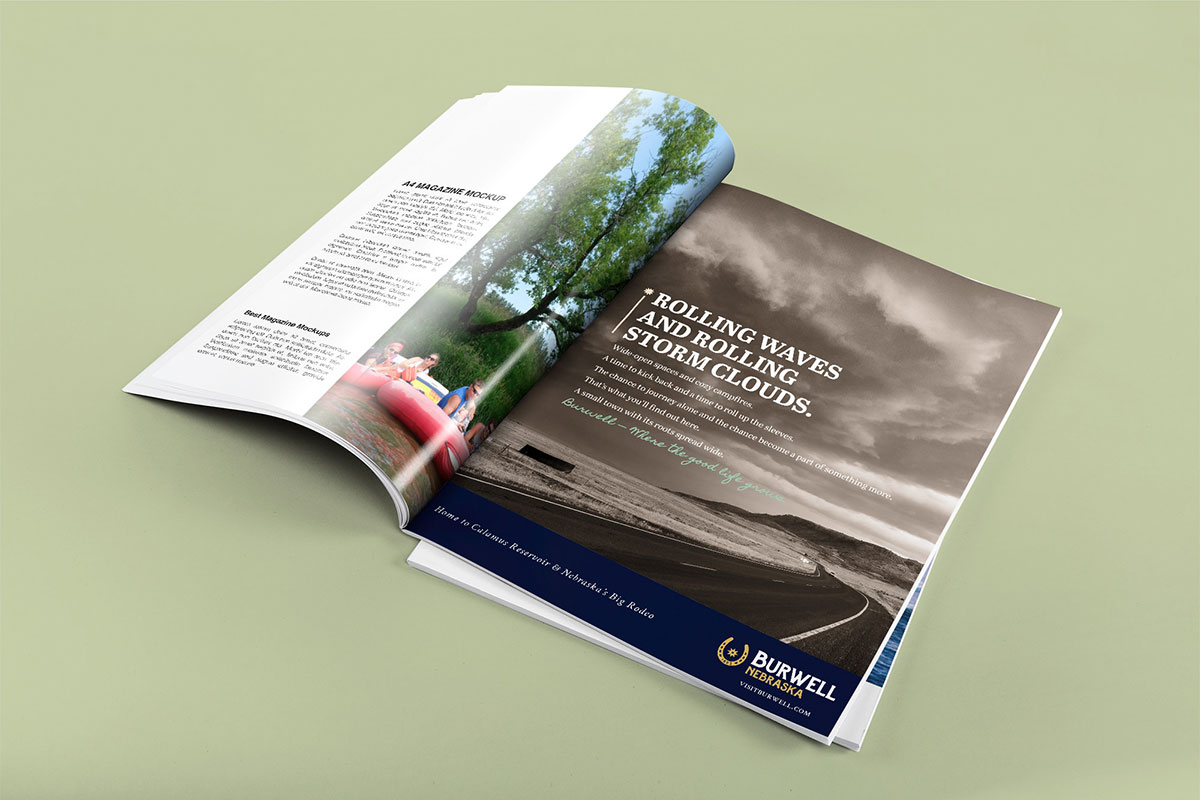
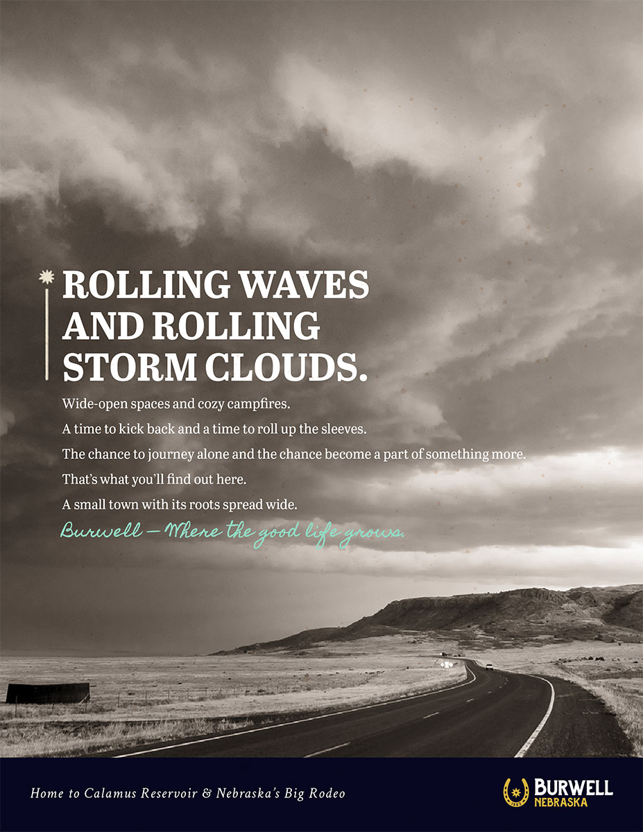
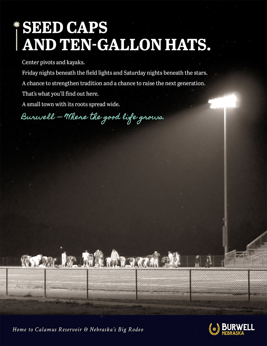
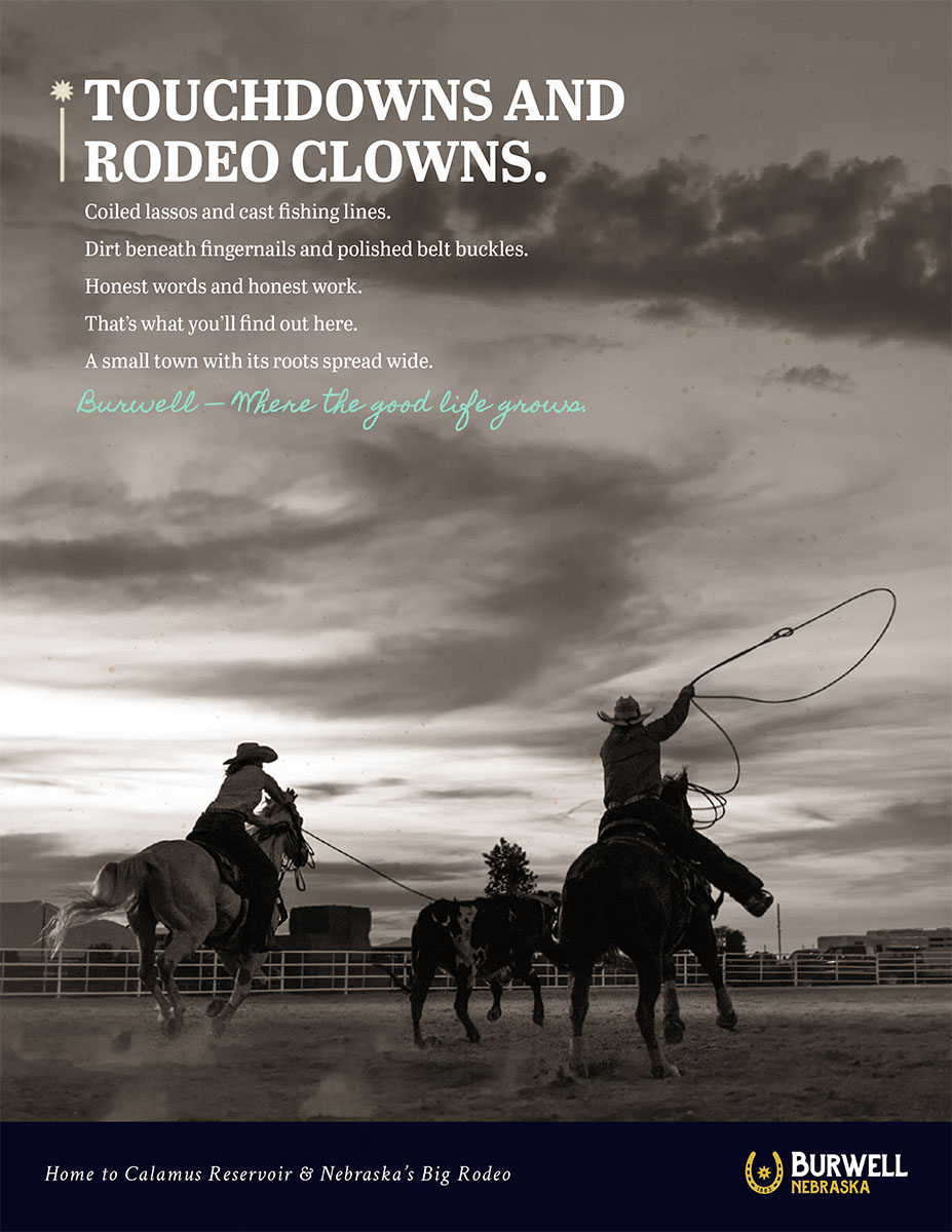
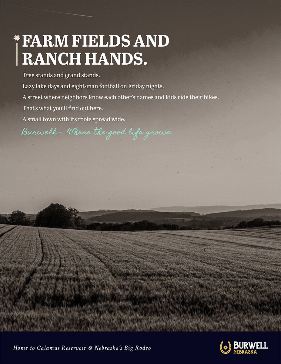
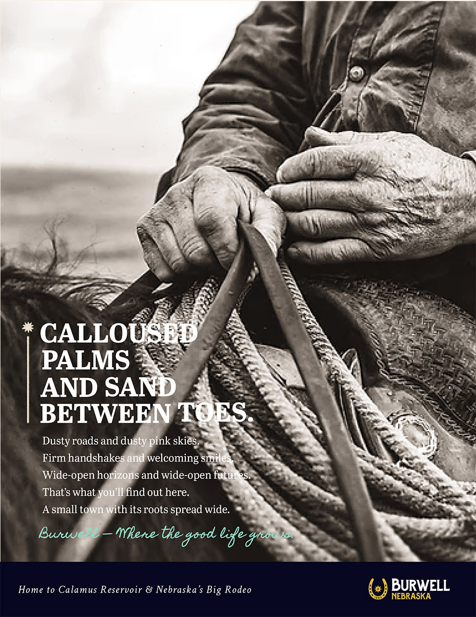
Once we had the tagline, the body copy followed, using a grouping technique to show seemingly disparate lifestyles that are actually quite similar and can all be found in “a small town with its roots spread wide.”
That is Burwell — Where the good life grows.
Logo & Visuals:
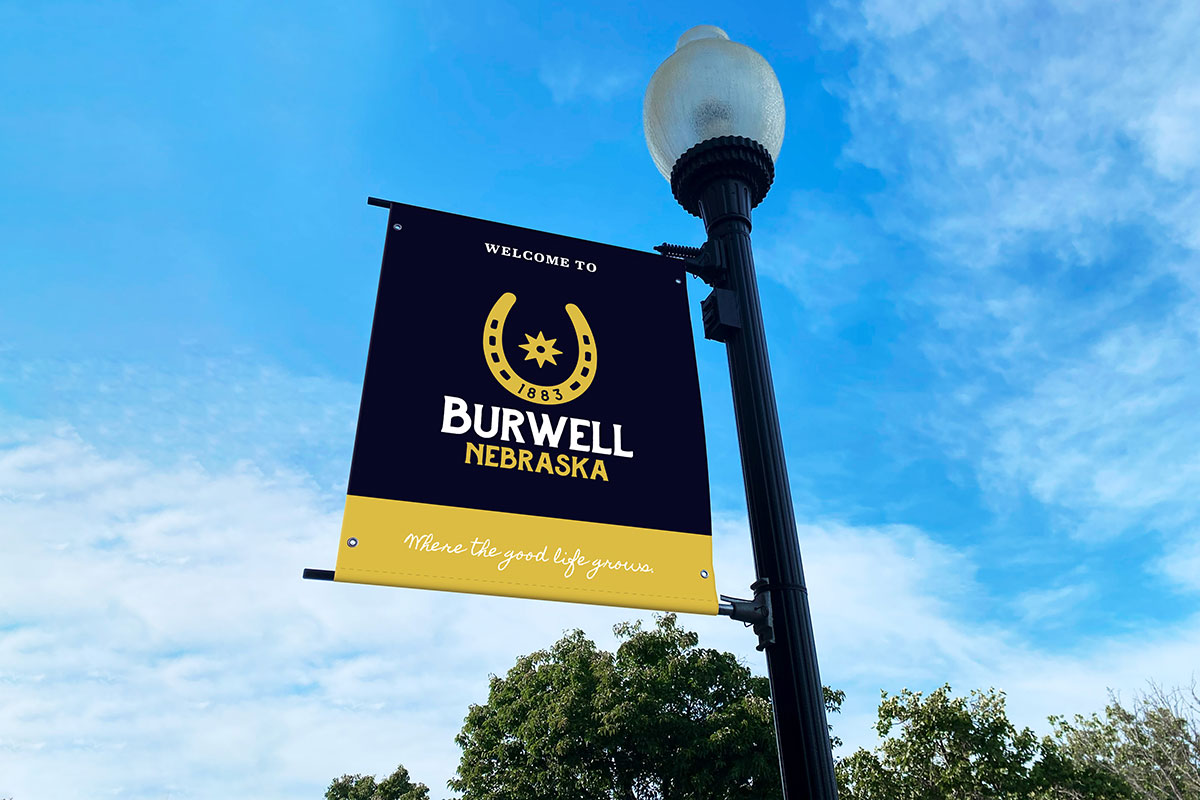
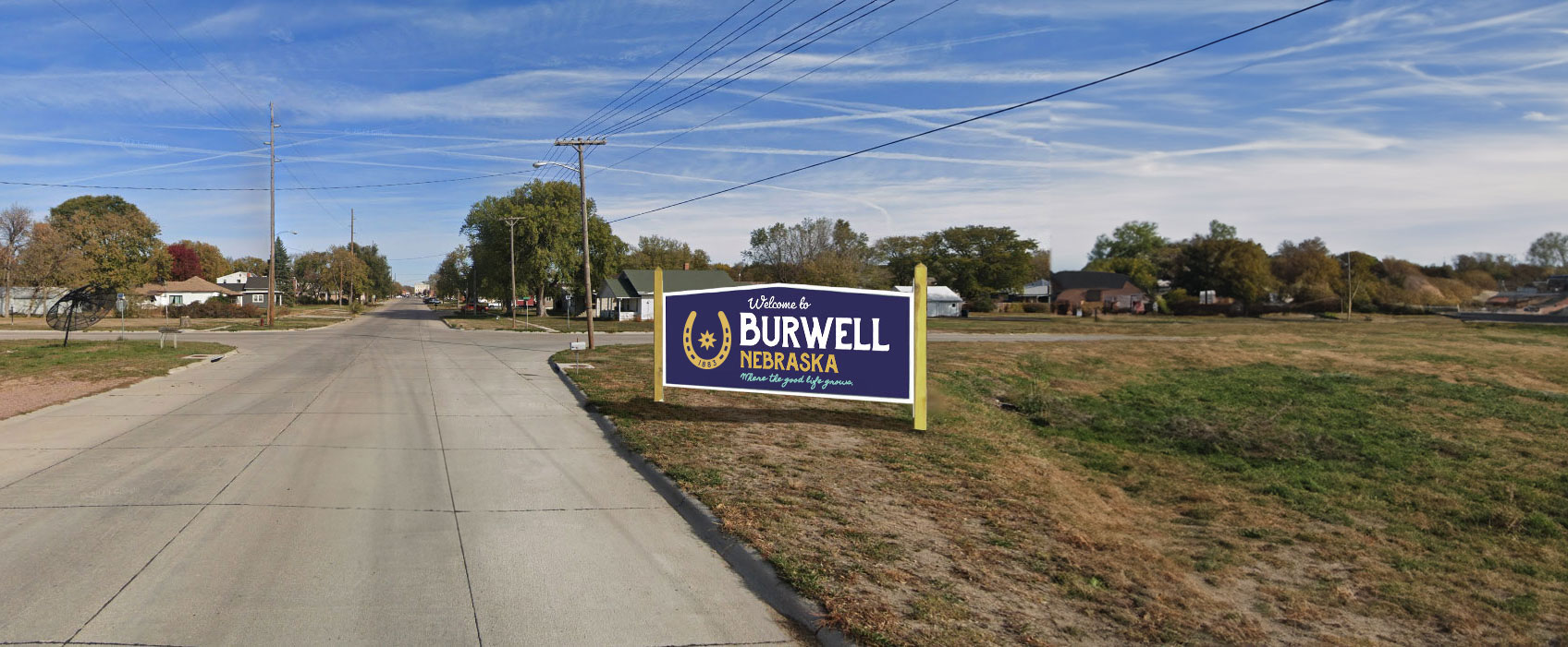
For the new logo development, we went through several rounds of options and revisions before arriving at the chosen logo. The horseshoe was included to pay homage to Nebraska’s Big Rodeo, while the brand colors were chosen to incorporate lake life vibes and school pride.
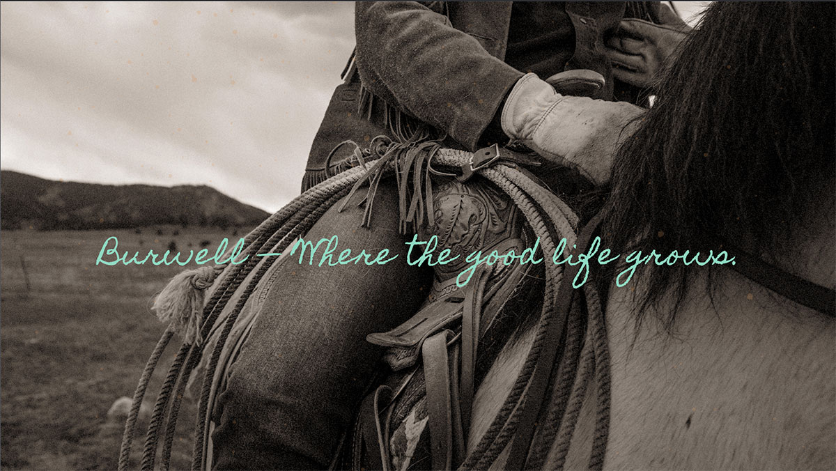
To make the new ads for Burwell stand out and feel timeless, we chose to apply a Sepia tone to all print and digital ads. This added a necessary element of grit, but also helped the ads stand out in crowded advertising environments full of overly glossy tourism ads.


